Part 1 | Behind the digital curtain: A closer look at game design
Part 1
What does a game designer do? That's a great question, and one with many answers. Whether it’s digital or tabletop, every game on the planet exists because one person (or a team of people) decided to bring an interactive vision to life. And while there’s a multitude of roles in the game development process, the designer holds an especially important one.
In 1967, philosopher Bernard Suits defined the word ‘game’ as a goal-directed activity>1 that generally adheres to a specific but arbitrarily determined set of rules. He distinguished games from ‘work’ by referencing their non-serious, recreational nature. Over three decades later, Katie Salen and Eric Zimmerman said that design was about conceiving the “rules and structures that result in an experience for players” 2.
It follows, then, that a game designer is someone who creates experiences which are governed by certain rules. The architects of video games, if you like. Of course, the role can vary. Some designers will dabble in programming, script-writing, or perhaps even concept art. But on the most basic level, game design means being able to translate an idea into a final product - usually one that is fun.
Crafting the blueprint
Long before any proper development begins, the designer needs to figure out a game’s essence — essentially, how it will play. Sean Fenemore is the design lead for Savage Yeti Games, a young, independent studio that hails from Canberra and whose origins start with the team of three studying at AIE. Tabletop games are his forte, and the team has between three to six brewing concurrently to keep a steady flow of ideas going.
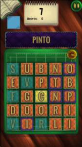
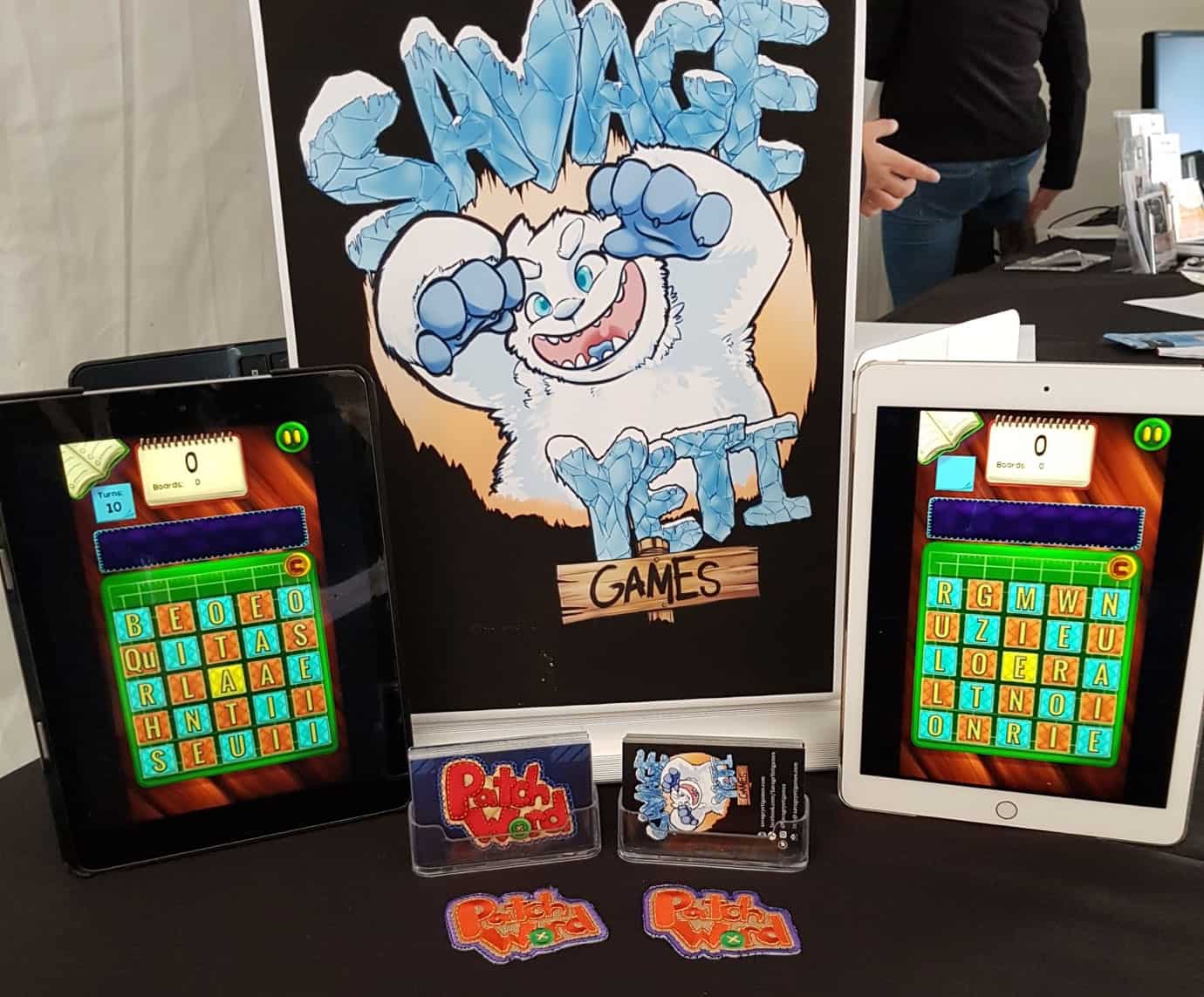
More recently, however, he’s been working on PatchWord, a word puzzler. It’s Savage Yeti’s first foray into the mobile game scene, and according to Fenemore, helping the team pin down that essence is always a crucial first step in the development cycle.

“As the designer I will ideally have a prototype, either digital or paper, that can demonstrate the core mechanics of the game...If we decide to make the game digitally, a Game Design Document (GDD) is written up with as much information as possible so that a more fleshed out, better made prototype can be put together.”
What seems like an easy task on the surface — mocking up a level with intuitive navigation, or outlining challenges that might keep a player interested — can actually require hours of hard work. Fenemore says it took him a whole day to get everything right.
“The game itself was prototyped using cardboard discs I had made using a new hole-punch that I was testing...I used so much cardboard just punching away that I thought I should actually use them for something. My partner likes word games, and had asked when I was going to design a game that she would like, so I played around with an idea and it seemed to work.”
Fenemore discovered his knack for design in childhood, although his path into game development was more of a happy accident. After flirting with the modding scene and an abandoned attempt at creating his own game, he took the plunge and enrolled in a game design course. That was when the muse to make PatchWord surfaced. To begin with, it was an unthemed word game. None of its characteristic quilt work and embroidery visuals were in use, but Savage Yeti’s research revealed that middle aged women were the power players of the word game market, so PatchWord began to evolve accordingly.
Like the countless games that preceded it, PatchWord was put together after a lot of back and forth between the team members. Hundreds of great ideas could pop up during a game’s ‘fermentation’ process, but ultimately, things like scope, requirements, and any conflicts need to be settled before the vision can make progress. You shouldn’t be afraid to kill an idea if it isn’t working, Fenemore adds.
Once a paper prototype was bolted down, he had the green light to move onto a digital concept.
By the tail end of 2017 — a year since the initial cardboard designs — PatchWord had been exhibited at PAX Aus thanks to support from AIE, and was sprinting to the finish line for a worldwide release. Fenemore says the team was fortunate enough to receive A $15,000 grant from the InnovationACT program to help cover translation and global marketing costs, which can pose financial barriers for indie studios.
Regardless, the uncertainty of market performance remained. How would PatchWord (or any game of its ilk) fare in the congested, uber competitive puzzle niche? The way Fenemore saw it, most extant word games typically came with a few drawbacks: mandatory online connectivity, ordered level progression, and opponents that mysteriously ‘vanished’ before the completion of a multiplayer match.
In order to avoid these problems, Savage Yeti had to change the script.
“Each PatchWord board is randomly generated which meant that there was no specified solution.” Fenemore explains. “This in turn meant that a hint system was unviable, due to the massive number of variables at play during the game. We also let the players use any words they wanted to try and solve the boards, just so long as they were in our dictionary (like most word games, we don’t allow proper nouns, slang or rude words). To add more difficulty, we also limited each word to being used once per game, where a game can consist of multiple boards.“
Thanks to statistical insights, Fenemore knew casual players tended to uninstall word games shortly after the initial download, and that informed Savage Yeti’s next move: make hardcore logophiles the main target.
“The hardcore word game player isn’t looking for flash-bang bells and whistles,” Fenemore reasons, “They are looking for the challenge, and an aesthetic that lets them stay immersed in the game without their concentration being shattered.”
Naturally, designing PatchWord for mobile came with certain limitations. But aside from battery and storage space woes, Fenemore and the team had to deal with more immediate technical issues, like making sure buttons were appropriately sized for a touch-screen device.
“With PC and console games, you have the controls separate from the screen whereas with mobile, the screen is also containing your controls. This means that a chunk of your screen real estate will be covered by the player’s hands and fingers. You also can’t have buttons that are too small or too large — unless they are active when the game is paused, and players can focus on where they are touching the screen.”
With PatchWord out in the wild, Savage Yeti has turned its focus towards Kid Witch, a new project that uses entirely different design conventions. Fenemore says it’s a couch multiplayer in development for PC, and if all goes to plan, console — but there’s already one likely guarantee: tinkering with touch screen controls won’t be on the laundry list.
Whilst it’s important for a game to have a cogent design framework, that’s only half the battle. The other half is making sure players have a fun experience. For Nick Cellini, who self-funded and created minimalist puzzle game Ashi: Lake of Light, it was the realisation that games can spawn a range of experiences that lured him towards design. His motivational fuel was a desire to explore twists on mechanics in existing games, and something a little more offbeat: Japanese cultural aesthetics.
“I am a big fan of minimalism,” Cellini admits.“Being able to do more with less is often a difficult task. My experience of the art from a more traditional Japan, like painting, calligraphy and architecture, has consistently attracted my admiration and respect.”
After two years of playtesting and absorbing player feedback, Ashi was ready. But it wasn’t like other puzzle games. It completely rebelled against the notion of throwing players into a furious gauntlet of time-based tasks.
“I believe encouraging a more relaxed, introspective experience can (also) be rewarding.”
Naturally, not all development follows a slow, methodical timeframe. Some is rapid by design.

